Concept and philosophy
Accamora is not just a simple bar, beer house or a bistrò, it is a place where is possible to tasting a good wine, chatting with friends, seeing a live concert or eating a tasty dish made with fresh and healthy ingredients.
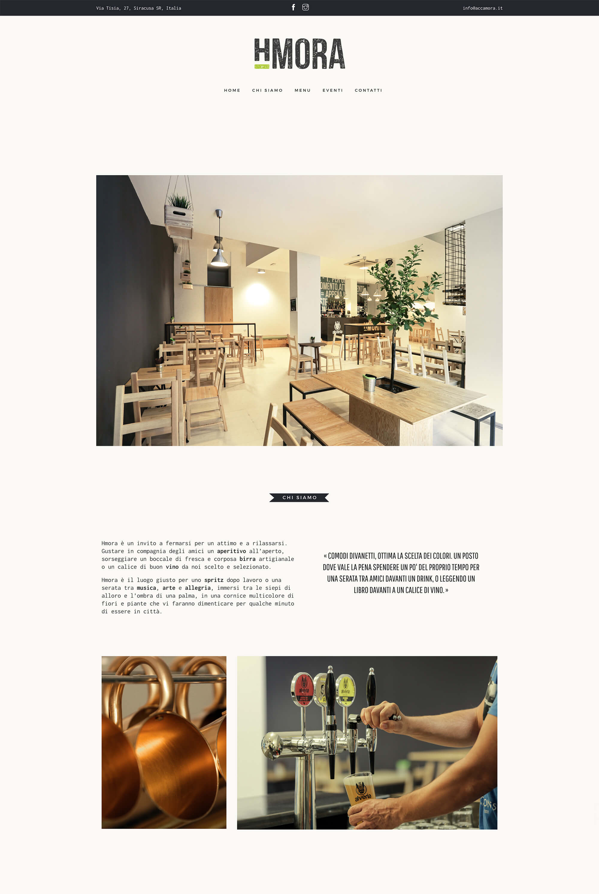
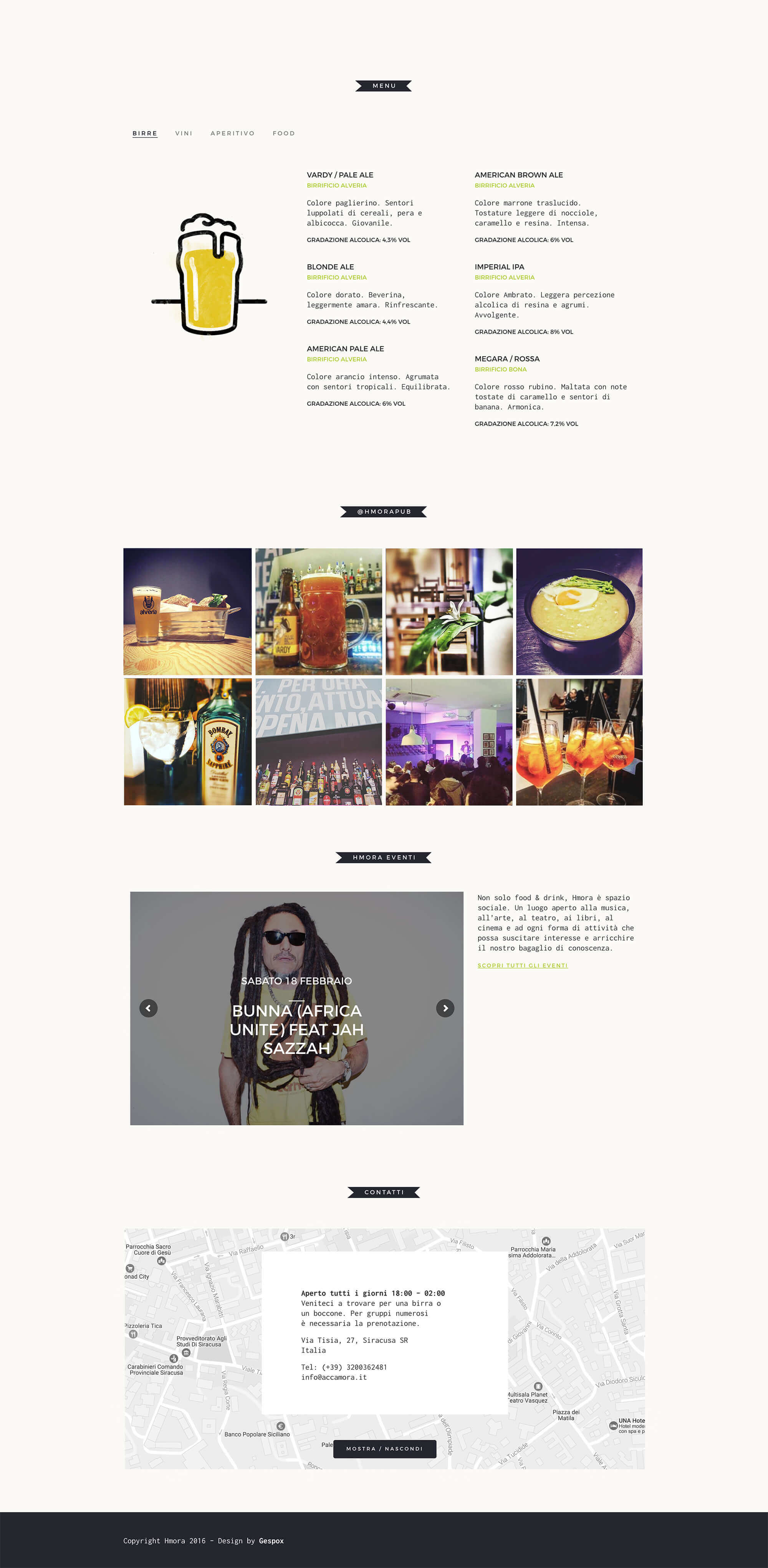
The website’s layout is minimal and tidy with a contemporary look, but a vintage flavor. The use of photographs is limited to few elements which are able to tell efficaciously regard the Accamora’s spaces and athmospheres.
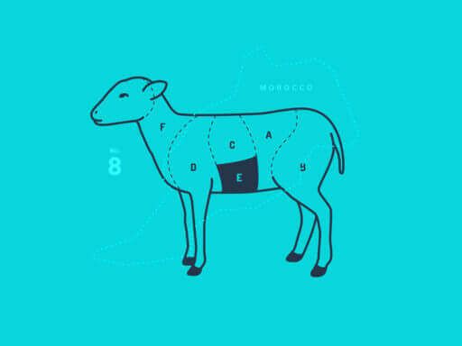
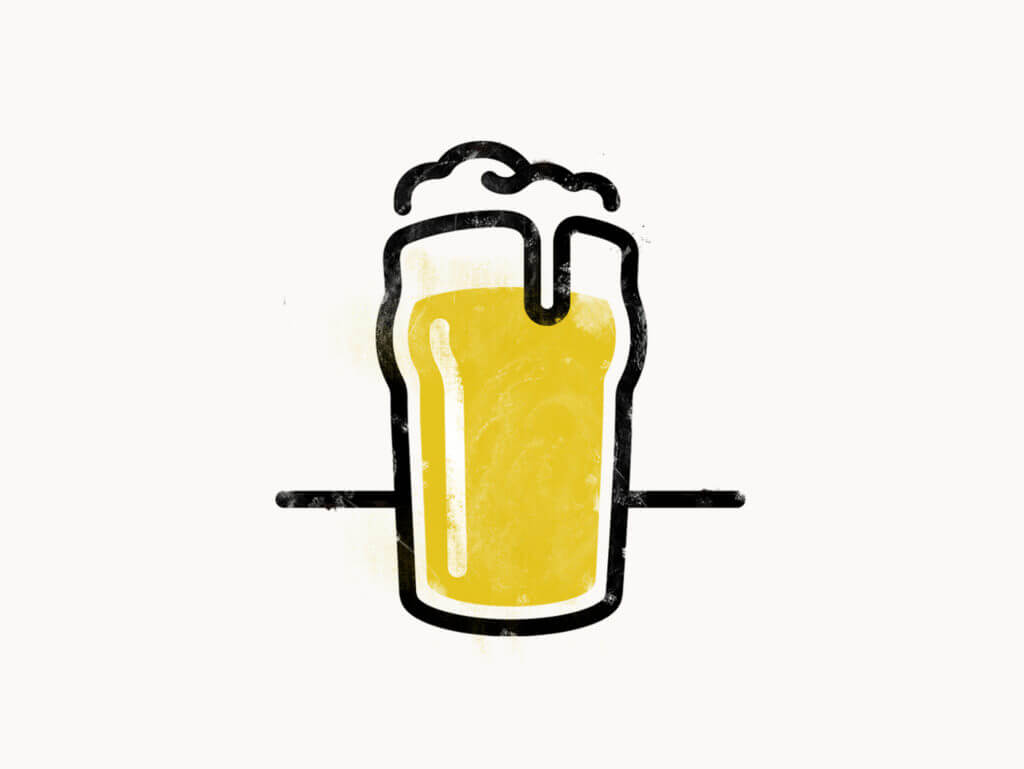
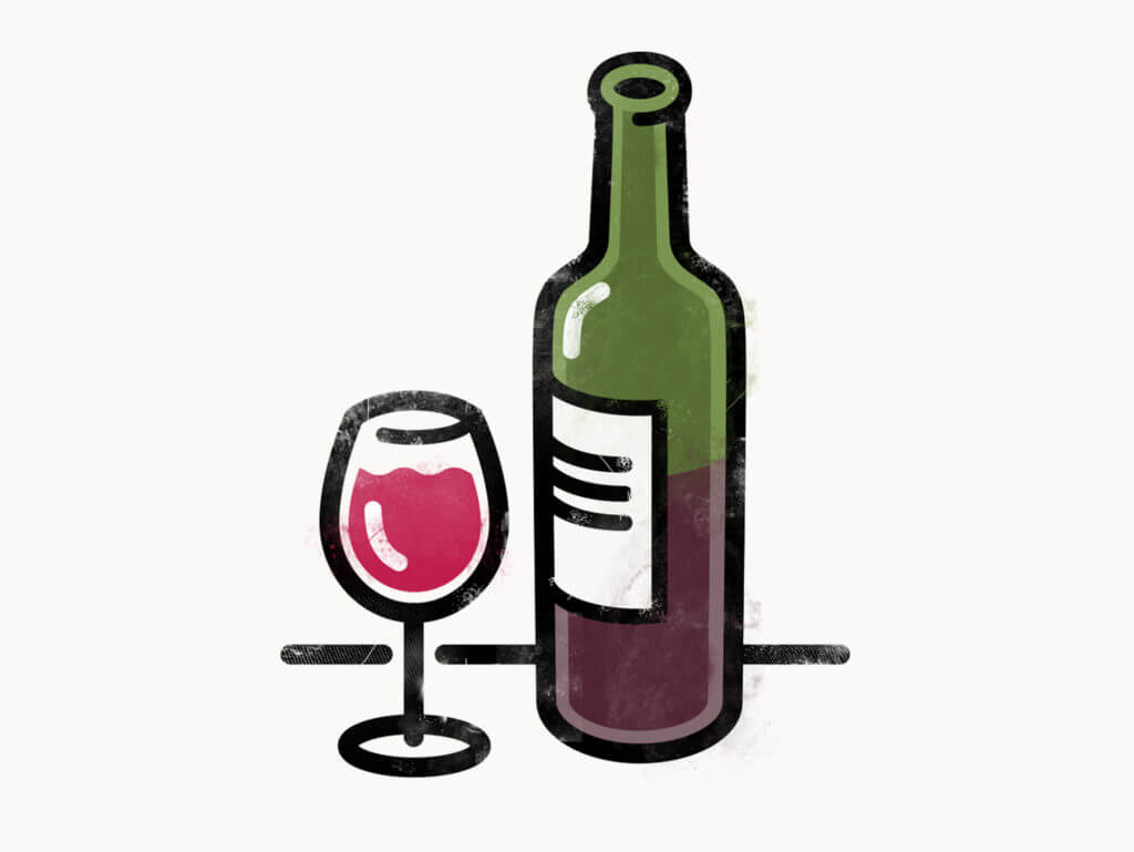
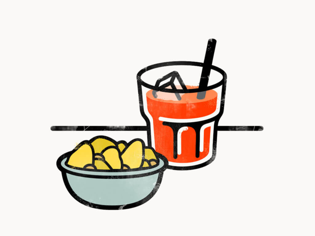
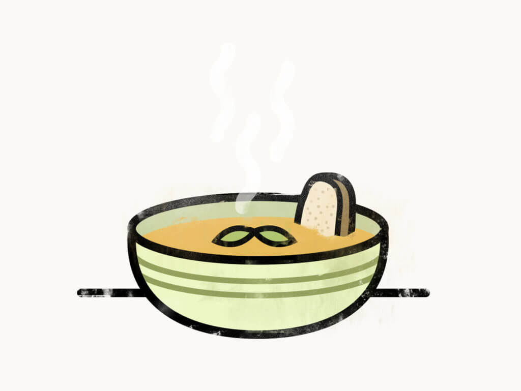
I drew a series of four coloured illustrations, with essential style, but raw finish touch, accordly to the different sections of menù: Beer, Wines, Appetizers and Food.
Identity
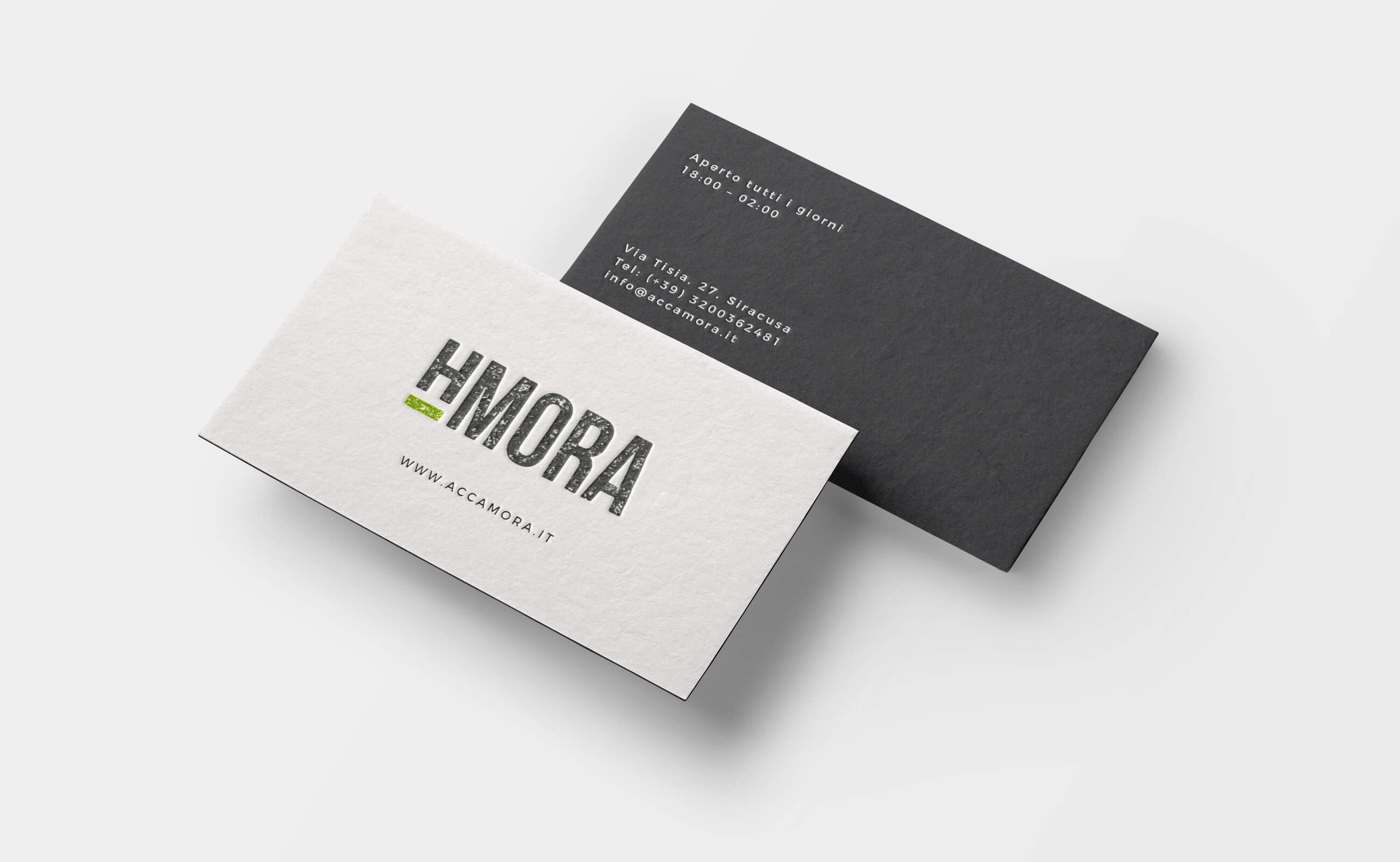
I designed the logo playing with the sounds of the letters of the name. The Italian pronunciation of the letter H is “Acca” just like the first four letters of the name Accamora. For this reason, the logo emphasizes the letter and replaces the first half of the name.
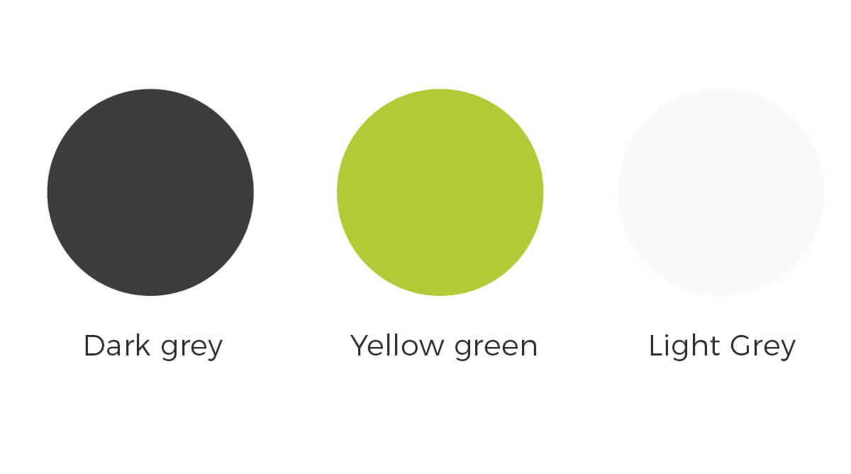
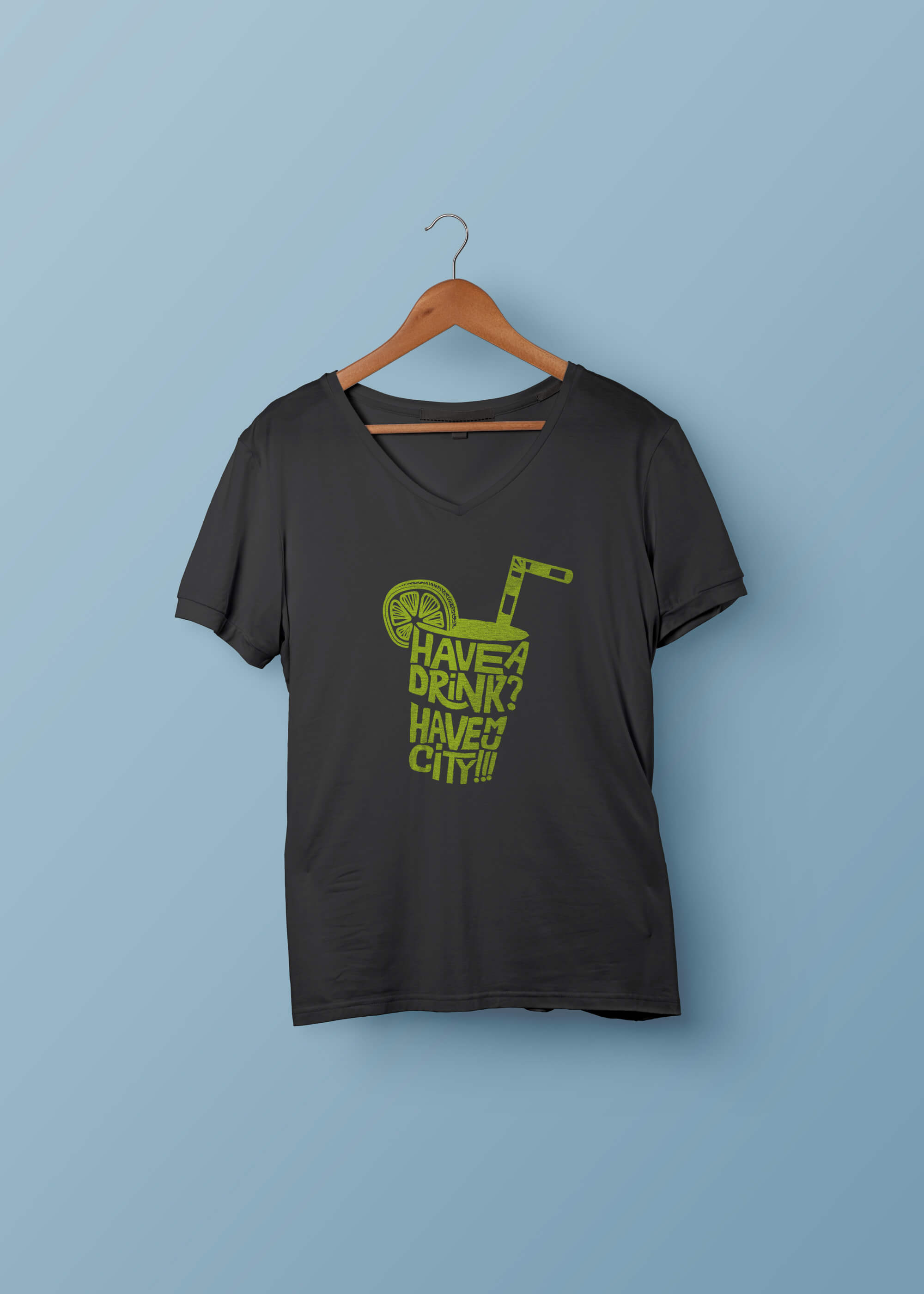
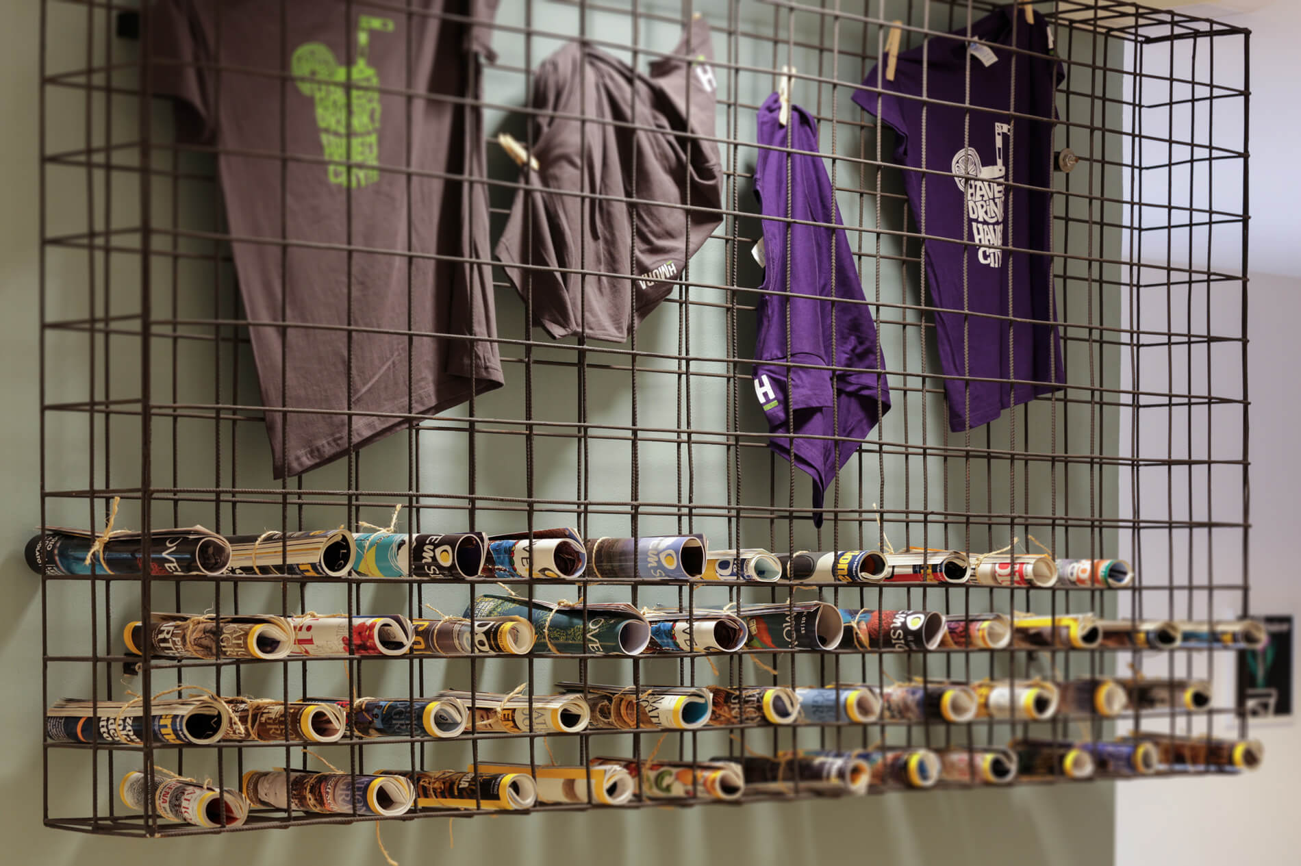
The color palette is inspired by the “green touch” that characterizes every aspect of the activities and products that are served.
From business cards to t-shirts, the whole corporate identity give a fresh and fun idea with a raw natural touch.